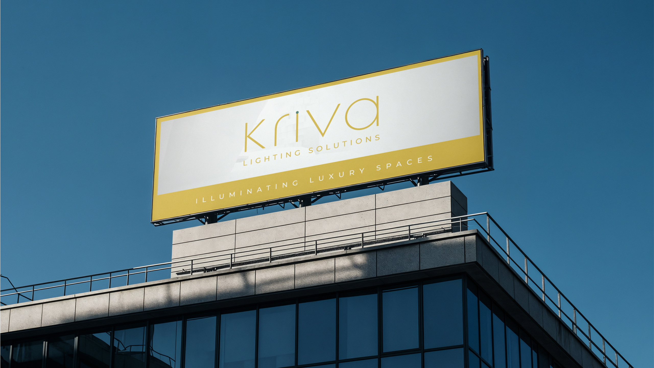
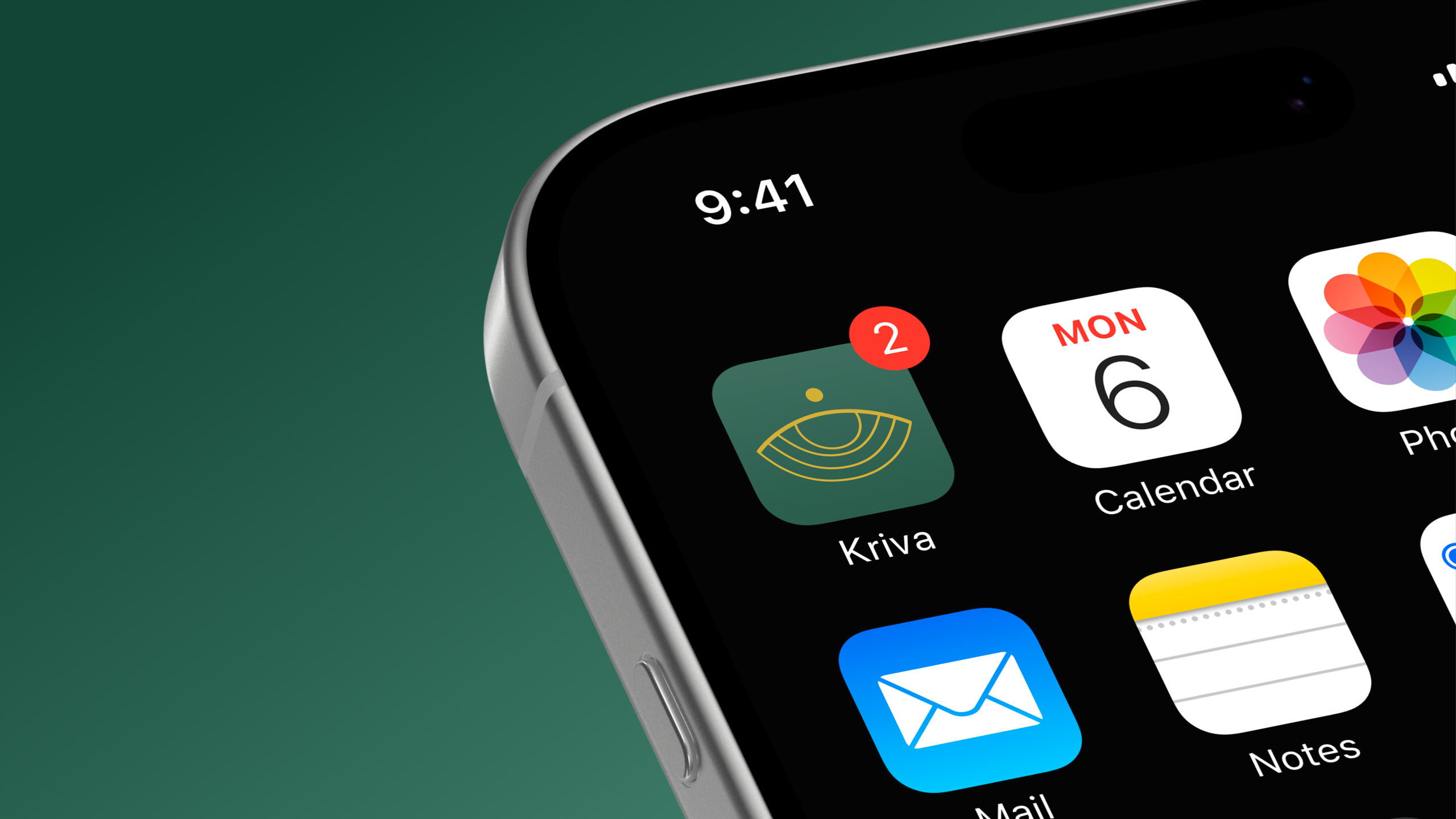
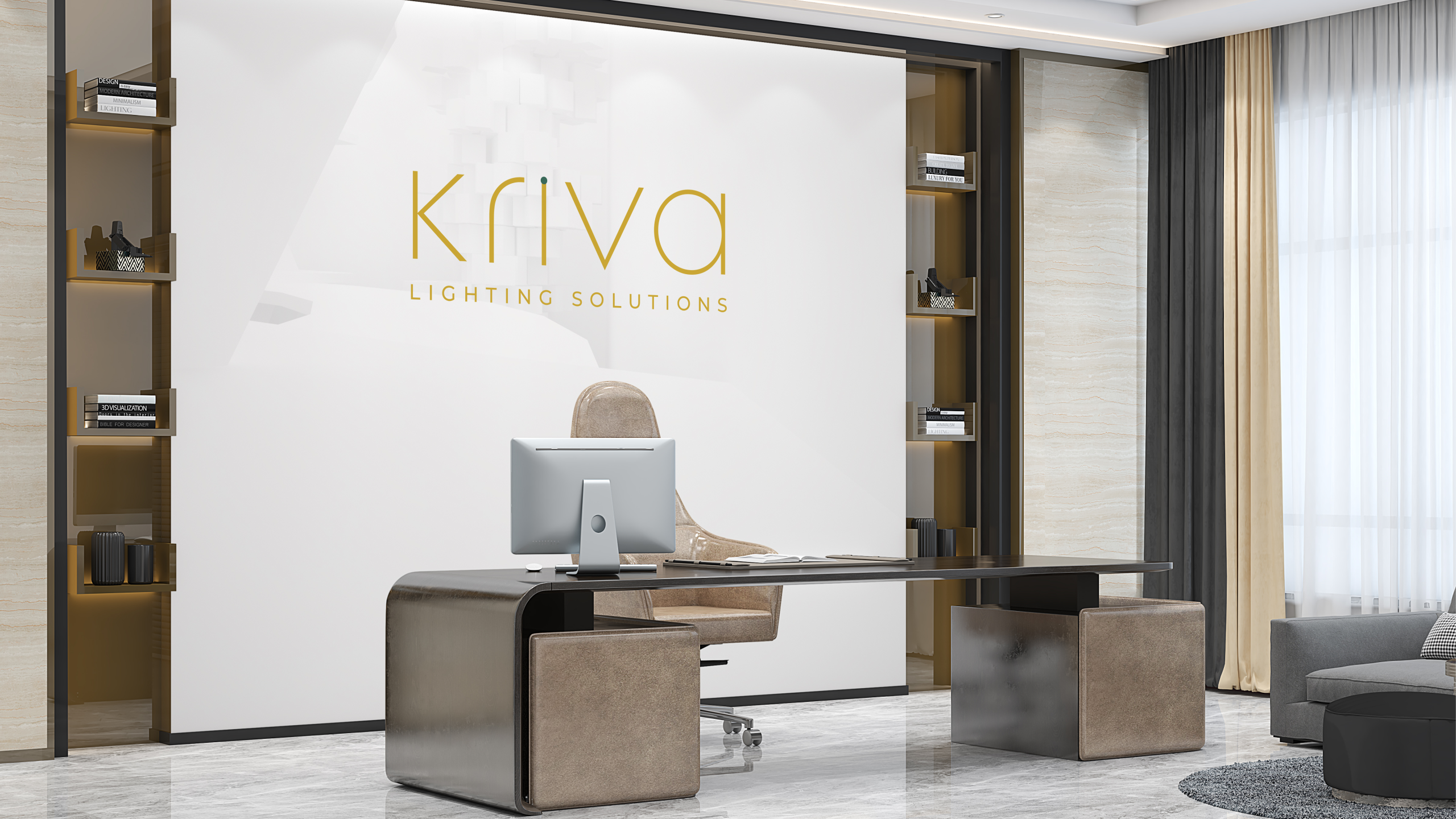
Maroo Lights requires a comprehensive rebrand to modernize its perception and discard its aging, traditional image. The project demands a complete fresh look, including a new company name, logo, and overall visual identity.
The updated brand must be designed with strict adherence to Vastu and Numerology guidelines for optimal success. This overhaul is intended to reposition them as a sophisticated, forward-thinking provider of lighting solutions.
Key Design Notes & Constraints
Vastu & Numerology Compliance
Sleek Modern Aesthetic
Advanced Lighting Identity
Comprehensive Brand Identity Development
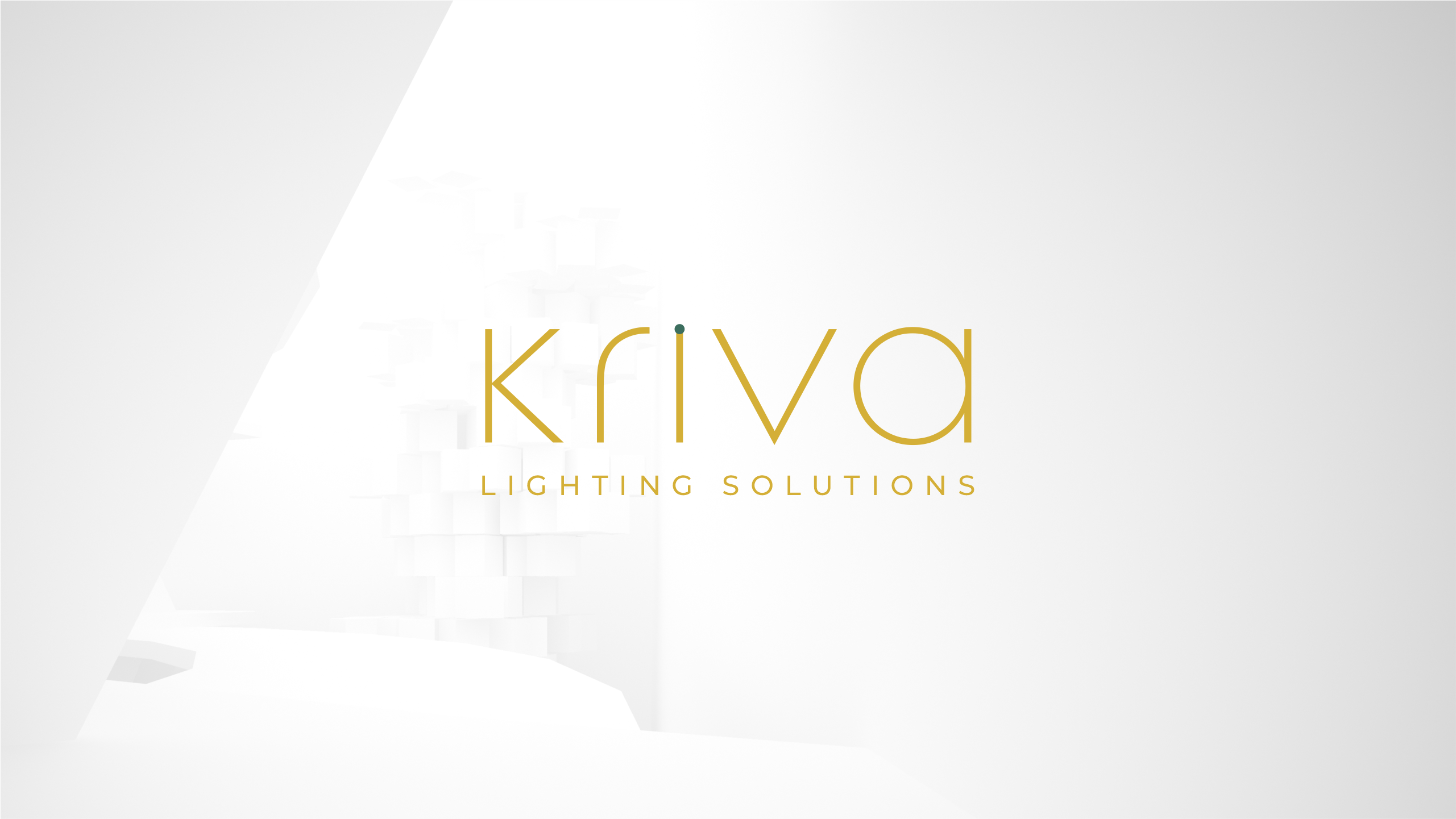
01. Strategic Brand Naming & Logo Design
This included proposing and finalizing a new company name, designing the primary logo, and establishing the foundational typography and color palette, all vetted for Vastu and Numerology compliance.
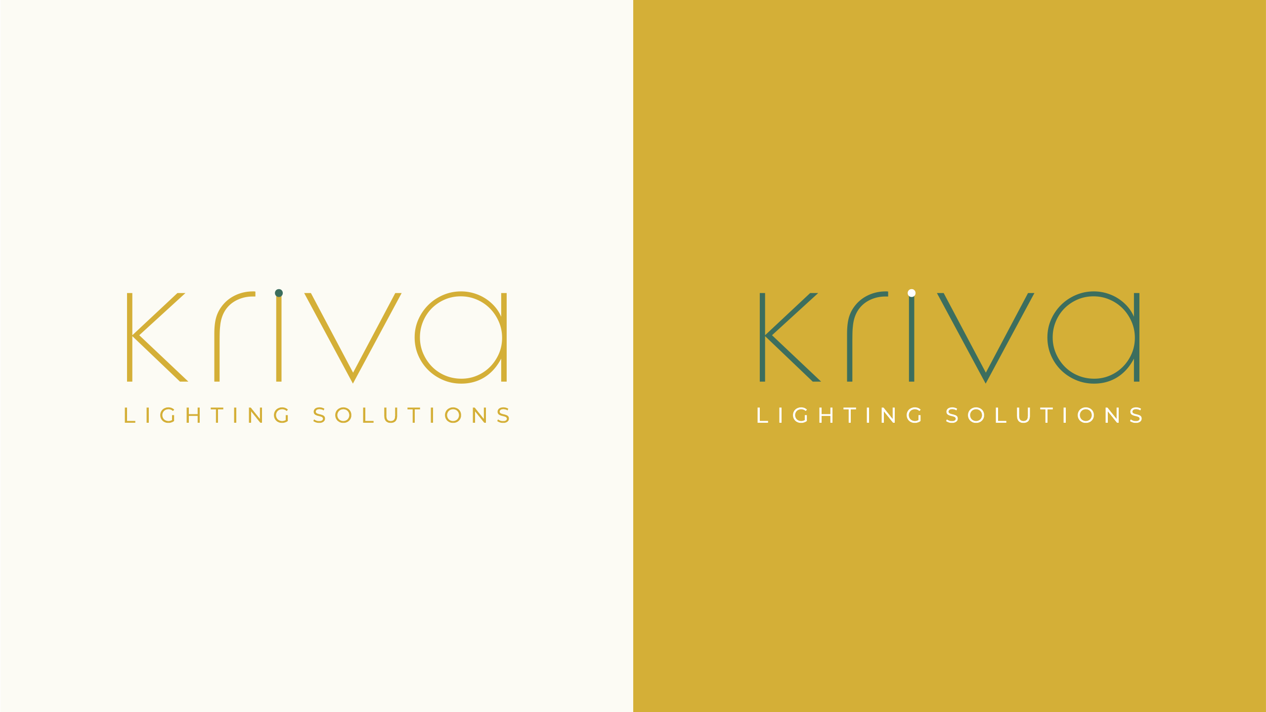
02. Core Brand Guidelines Manual
Development of a comprehensive style guide detailing logo usage, color values, font hierarchy, and imagery standards to ensure consistency across all future marketing and product applications.
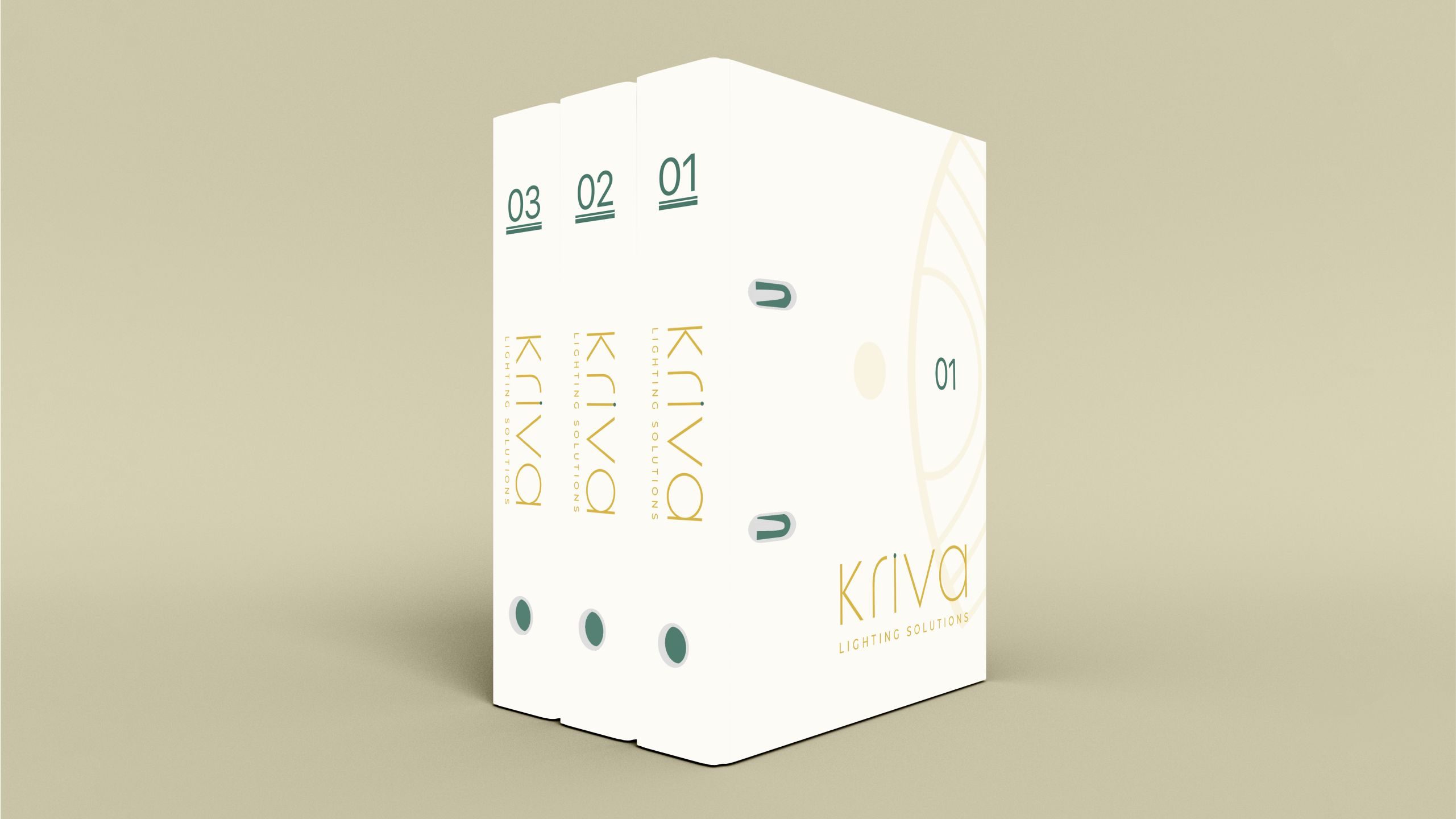
03. Physical & Digital Collateral Suite
Design and preparation of all essential brand assets, ranging from business stationery, product packaging, and uniform/ID card designs to digital templates for presentations and social media.